
Know-How #2
Lean Canvas Part II - Business Modelling in Implementation
In Part I of the series on the Lean Canvas, the tool is described as a kind of Google Maps for founders. In this context, the aspects of planning were dealt with in particular. Part IIis now dedicated to the implementation, i.e. the actual navigation.
Google Maps for your start-up project
Once the ideal route from the starting point to the intended destination has been drawn, the journey can begin. The Google Maps user sits down in his vehicle and lets himself be navigated according to the route guidance. But what happens in the event of a traffic jam? The route changes. Google Maps adjusts its routing according to traffic conditions to continue to get to the destination on the best possible route.
This is where we bridge back to the Lean Canvas. The underlying philosophy (Lean Startup), aims to help founders navigate an environment of high uncertainty. To achieve this, the laid out plan is constantly adjusted and re-aligned to the goal, much like a navigation device.
The benefit of the Lean Canvas (and its underlying philosophy) in the context of a startup, then, is that it maximizes value for customers while minimizing the use of resources.
From assumptions to validated knowledge
As mentioned at the beginning, one of the most important features of the Lean Canvas is to bring all relevant aspects together on one page in a short time. A valuable side effect is that time-consuming over-planning is avoided. By writing down simple assumptions about customer problems and co., a capture of the intuition of the responsible person is achieved. This intuition is virtually the counterpart to vehement and lengthy planning, which is not wrong per se, but often overshoots its target. But is the intuitive assumption always right? Hardly. This is where the added value of the Lean Canvas becomes visible in the founding process: It helps to systematize intuition. In the further course of the project, the initial assumptions are processed into validated knowledge.
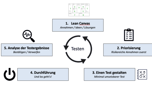
Assumption Validation Cycle
To achieve the validation referred to, each relevant assumption made as part of the project planning is tested. The following figure shows a cycle with the Lean Canvas (and its assumptions) in the first place and a prioritization call in the second place.
The "riskiest" assumptions should be tested first, which are those related to customer segments and problems. If these are uncertain or even wrong, the whole project is on very shaky ground. Successively, the targeted solutions are to be named as the most risky. Further prioritization can now be taken from the corresponding order of the Lean Canvas (see Part I. It should be mentioned again at this point that this order is not universally valid).
The third step deals with setting up an experiment. Here two basic questions are addressed:
What do I want to learn?
What have I learned?
The test must therefore be designed from the outset in such a way that it covers the underlying assumption (1. What do I want to learn?) and, in addition, offers the possibilities for analysis by means of key figures (2. What have I learned?). Thus, criteria for confirming or rejecting the assumption are first formed. Furthermore, the most important observations are recorded and next steps are derived from the test results.
To measure progress, appropriate metrics must be found and tracked. But what does a suitable key figure look like? What requirements does it have to meet? In order to answer these questions, the difference between beauty and relative indicators will be discussed.
Beauty rat ios show absolute values. They have no relation to the performance rendered and are therefore not a good basis for decision-making. As an example, the key figure "number of new customers" can be mentioned. 500 new customers! Thisnumber alone can look very nice. However, it says nothing about the circumstances under which it was achieved. How much time was estimated? How many employees were involved? What were the marketing costs? It becomes clear that the value alone says nothing about the service provided and can therefore quickly be misleading.
In contrast to this are relative key figures. As the name suggests, these are numbers that put at least two values into a ratio. To stay with the example mentioned, we can now expand the number of new customers by the number of sales employees. This gives us the number of new customers per employee. This value can also be related to a time period, for example, in order to make any seasonal effects visible. Through the relative key figure, the performance achieved can be read off directly.
After the implementation(step 4), the results can now be analyzed in step 5, based on the previously defined key figures.
Transfer back into the Lean Canvas
After successfully testing the corresponding assumption, the new findings (or the confirmation of the old ones) are transferred to the Lean Canvas. In this way, you successively work your way from a customer problem to a value-added solution that is documented and reproducible.